Why Your Store’s “Helpful Extras” Are Secretly Driving Customers Away

The Cost of Trying Too Hard
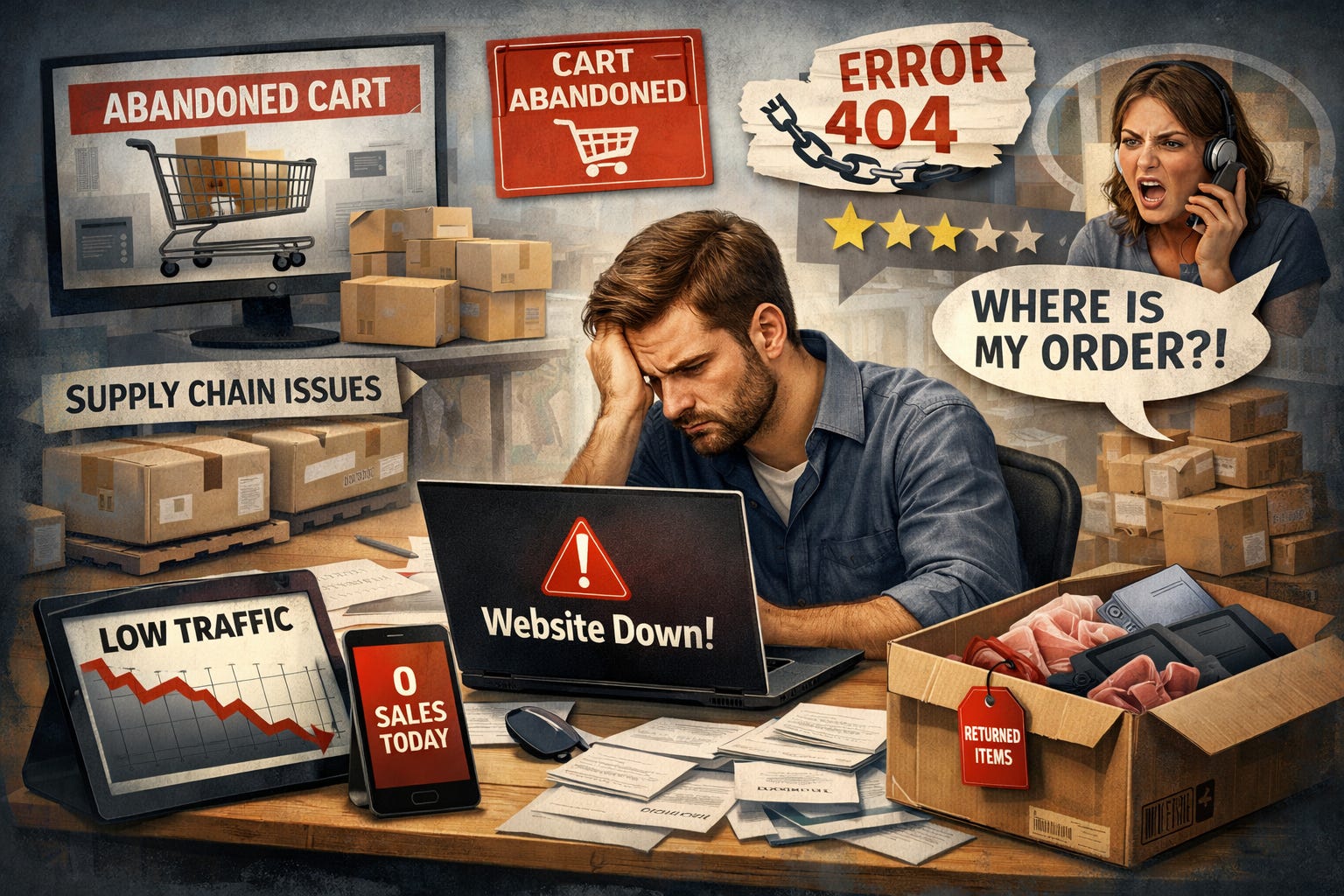
You open your store analytics and feel frustrated. Traffic looks solid. Pageviews are climbing. Yet sales remain flat. You spent hours adding comparison tables, pop-ups for guides, and banners promising free shipping on future orders. You assumed more information equals more trust.
It does not.
Most stores overload customers with help before they even know what they need. You may think you are reducing hesitation, but you are actually creating decision fatigue. Every extra click, every popup, every micro-choice adds invisible friction that makes customers pause, reconsider, and sometimes leave entirely.
How “Helpful Extras” Backfire
You added:
• Comparison charts for similar products
• Side-by-side reviews
• Multiple guarantees and disclaimers
• Optional upsells everywhere
• Excessive FAQ sections
Individually, they seem useful. Together, they clutter focus and teach your customers to doubt themselves. They look at your store and unconsciously think: maybe I should wait. Maybe I need to research more. Maybe this is more complicated than I realized.
Decision-making is not binary. It is emotional. You can’t offset complexity with more explanation.
The Psychology of Friction
Humans do not naturally optimize decisions under stress. Each added choice triggers cognitive load. Your “helpful extras” force buyers into mini-assessments every time they scroll.
Cognitive science shows that decision fatigue reduces conversion, even for loyal customers. People abandon carts not because they don’t want the product but because your store trained them to hesitate.
How Top Stores Turn Complexity Into Clarity
The most profitable stores remove unnecessary extras and highlight one main path forward. They teach momentum instead of caution. They simplify and guide rather than overwhelm.
Consider this: a home goods store removed its side-by-side comparison tool and replaced it with a single recommended product. Conversion rose 23 percent in the following week. Another fashion brand collapsed multi-option variants into a single best choice with clear styling suggestions. Returns dropped by 18 percent.
These are practical changes that don’t require extra traffic. They work because they respect how your customers make decisions.
Five Steps You Can Apply This Week
1. Audit Your Pop-ups and Guides
Look at every overlay and informational box. Ask: does this simplify choice or add friction? Remove or consolidate those that confuse.
2. Highlight a Default Option
Give customers a recommended choice. Let them start from a position of confidence. Optional alternatives can live further down the page.
3. Simplify Your Navigation
Too many categories or filters create micro-pauses. Collapse them where possible and focus attention on the main journey.
4. Reduce Reassurance Language
Guarantees and disclaimers are important but can be streamlined. Customers respond better to one clear promise than a wall of text.
5. Measure Decision Time
Use session recordings to track how long customers pause on key pages. If hesitation is long, simplify content or restructure the layout to guide them forward.
Why Simplifying Increases Revenue
Simplicity signals authority. It reduces cognitive load and fosters trust. Google rewards engaging, clear experiences. Users spend more time on focused pages and convert more often.
By removing unnecessary “helpful extras,” you teach your customers to act instead of overthinking. Momentum converts faster than persuasion.
The Bigger Lesson
Your store’s design teaches behavior. Every choice you make communicates expectation. Overloading information, even with the best intentions, teaches hesitation. Clear paths teach action.
Focus on reducing friction, highlighting one path forward, and guiding the buyer confidently. Customers notice clarity. Revenue follows naturally.